
 |
| The Most Beautiful Typewriter Source: Machines of Loving Grace |
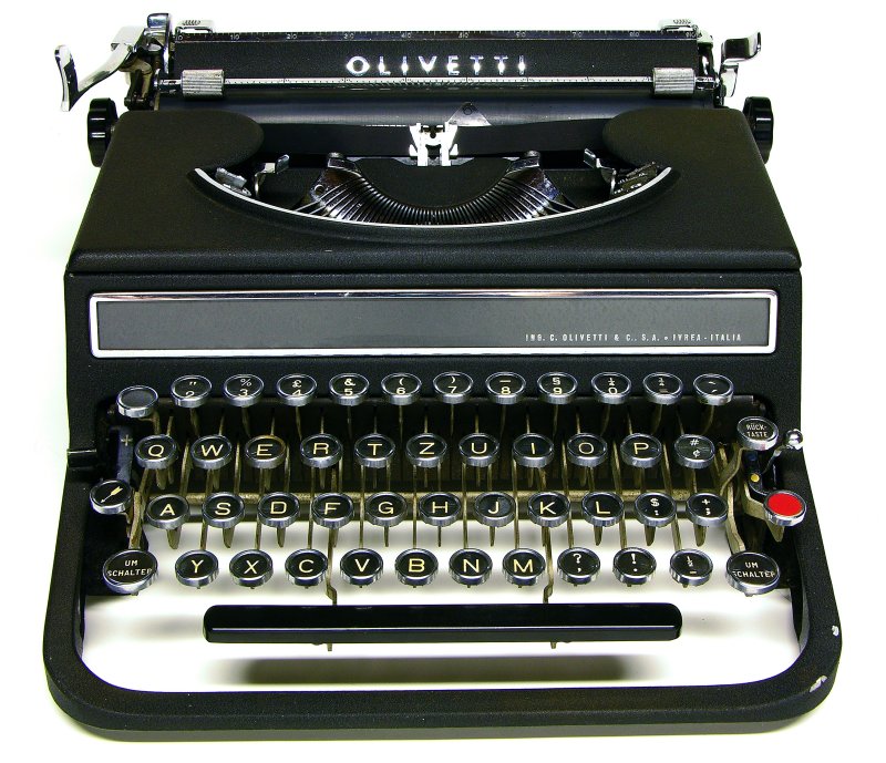
I do not have an Olivetti Studio 42, but I dream of owning one. If I found this machine (in good condition) I would stop collecting. It's that special.
To assist in proving that the Olivetti Studio 42 is "The Most Beautiful Typewriter" I will be using Dieter Rams' 10 Principles of Good Design. I really connect with Rams' aesthetic and think that the principles he created can really help prove my assertion.
 |
| Fig. 2 Source: Machines of Loving Grace |
Good design makes a product useful. There are no unnecessary buttons or levers on the OS42 This isn't unique to this Olivetti. It seems as if typewriters of this vintage are, usually, immune to the stupid gadgetry of typewriters in the 1960s.
Good design is aesthetic. The aesthetic quality of a device is integral to it's usefulness because people use these devices every day to shape their lives. If you use it every day, then it must be beautiful. The Olivetti Studio 42 is a beautiful machine.
Good design makes a product understandable. This is an attribute common to typewriters as a whole. There is (usually) no mystery in how to use the most basic functions of a typewriter; press a button and print out a letter. Where typewriters become incomprehensible is when features are hidden. A perfect example of this is the Remington Travel-Riter. The carriage locks with a small, almost completely unnoticeable lever on the right-hand side of the spool cover. If you were unaware of this stupid little button you would, perhaps, think that the machine is broken when, in fact, the designers were merely idiots. A carriage lock should be on the carriage. That would make sense. The OS42 makes sense.
 |
| Source: Machines of Loving Grace |
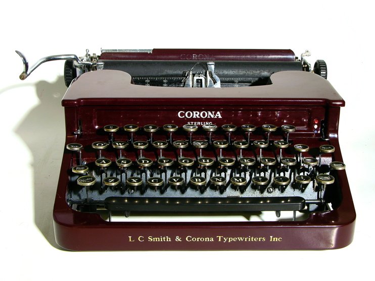
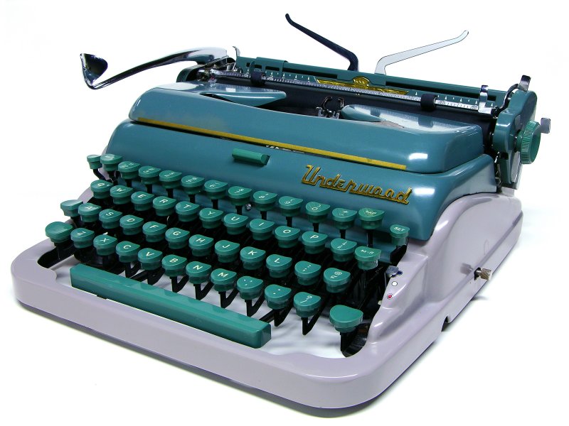
Good design is honest. When style overrides design you get products that cannot live up to our physical expectations. The perfect illustrative would be the Underwood Deluxe. The influence of automobile styling instantaneously makes this typewriter seem outdated. This, however, was the goal of the American automobile industry in the 1950s; they wanted to
 |
| Source: Machines of Loving Grace |
 |
| Source: Apple Computer |
Good design is thorough down to the last detail. Who hasn't been annoyed by a poorly designed latch, catch, or lever. Nothing on the OS42 seems to be left to chance. Look at the red tabulator button. Genius!
Good design is environmentally friendly. If a product is meant to last decades rather than years it is innately friendly to the environment. When something is meant to be thrown away when it is no longer fashionable, that is poor design.
Just look at it. It's gorgeous. I hope you would agree with me that the Olivetti Studio 42 is "The Most Beautiful Typewriter." I would love to hear other opinions.