This afternoon I spent a little time preparing a typewriter for a special young lady. Diana is Alhambra's valedictorian and I found out that she wanted a typewriter of her own. From what I gather, she had worked hard all year in a part-time job and her tax return was going to be used to buy the typewriter of her dreams. Well, I've seen what's out there and I was positive I had the perfect machine for her…and gratis too. She can keep the tax return. It's this Hermes 2000:
 |
| Wow, the iPad camera is pretty grainy in medium-light situations. |
 |
| I really must get some better pictures tomorrow. |
As it was in a fine condition when it came to me I only had to clean it up a little and throw a ribbon in it.
 |
| This looks more green, but still sickly. |
I had offered a few other machines, but it was the Hermes 2000 that she really wanted. Until I had the joy of getting this one ready for a new user, I was unaware of how lovely they are. This diminutive gem has a touch regulator and you can tune it quite nicely to your typing peccadilloes. I feel the touch is less "pillowy" than the Hermes 3000. It's not snappy, it's soft in the first half of the key press and then it thickens in the last half. It's quietly muffled like all Hermes are and is not distracting in the least. As one is inured to the rhythm and cadence required from the 2000– the commonest problem being skipped letters originating from the type bar segment antipodes– the experience becomes smooth and enjoyable. I have heard that the letter 'a' is a particular nuisance to our more ham-fisted Typospherians, but I have never had that sort of problem.

While this post comes at the nadir of St. Patricks Day it is appropriate that this Typegrant is green. The greenness bends more to the mint and less to the kelly, but the sentiment is the same. And to honor those of Irish blood here is a link to a very interesting report by Michael Everton on Irish Typewriter Keyboards. This link comes by way of Richard Polt's very stimulating website. It's very interesting and there are samples of the typefaces too. Absolutely beautiful!
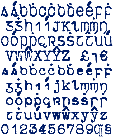 |
| Royal Doire from http://www.evertype.com/celtscript/type-keys.htm |


